Moscow
![]() en
en

You recognize McDonald's golden arches from a block away. You know Apple's bitten apple without any text. You can tell a WhatsApp notification from any other sound.
That's brand identity at work.
Brand identity is everything that makes a company recognizable and memorable. It answers one simple question: How do people know it's us?
Why does it matter? The more competitors a business has, the more identity matters. A local coffee shop competing with ten others needs strong identity to stand out. A monopoly like a state railroad? Not so much.
People often confuse these terms. Here's the difference:
Visual identity = How a brand looks. Logo, colors, fonts, imagery.
Brand identity = The complete personality. Visual identity + sounds + smells + textures + tone of voice + customer experience.
Think of it this way: visual identity is how someone dresses. Brand identity is their entire personality.
Most people think brand identity is just logos and colors. In reality, great brands engage all five senses.
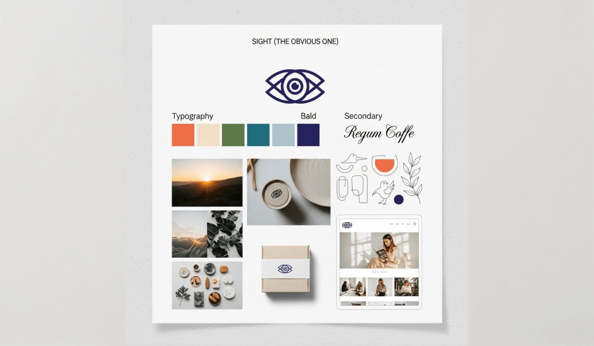
Sight (The Obvious One)
Sound
Intel's four-note chime. Netflix's "ta-dum." The specific playlist in Zara stores. Sonic branding is powerful because we process sound faster than visuals.
Smell
Luxury hotels pump signature scents through their lobbies. Singapore Airlines has a patented fragrance. Abercrombie & Fitch stores are famous (or infamous) for their strong cologne smell.
Why? Smell is the sense most closely linked to memory. A scent can trigger instant brand recognition.
Taste
Touch

You can build basic brand identity with just three elements: logo, typography, and color. Everything else builds from there.
Logo: The Face
A logo is a brand's most recognizable element. It needs to work at every size—from a tiny favicon to a building sign.
Types of logos:
Simple logos are usually better. They're easier to recognize and remember.
Typography: the Voice
Fonts communicate personality before anyone reads a word.
Banks love serif fonts. Tech startups love sans-serif.
But these are just conventions—good designers can break any rule purposefully.
Color: the Emotion
Color influences up to 85% of purchase decisions. It works on a subconscious level.
Quick color psychology:
Fun fact: orange is the only color with almost no negative associations across cultures. That's why many global brands use it.
Apple
Minimalism as identity. The bitten apple logo is instantly recognizable. Colors: white, black, silver. Materials: aluminum, glass. Even unboxing an iPhone is a designed tactile experience.
What makes it work: relentless consistency. Every touchpoint feels premium and intentional.
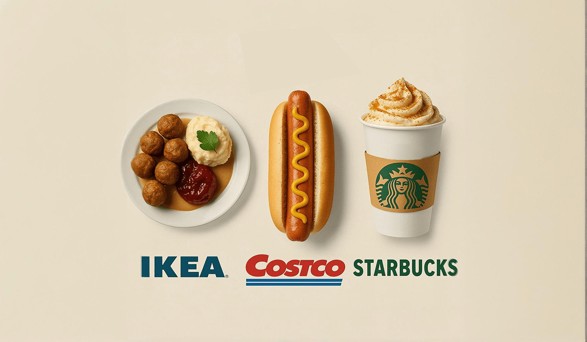
McDonald's
Bright, friendly, impossible to miss. Golden arches visible from highways. Red triggers appetite. "I'm Lovin' It" jingle is global earworm. Even the smell of fries is engineered to travel.
What makes it work: designed for recognition speed. You process McDonald's branding before you consciously think about it.
Nike
Built around movement and motivation. The "swoosh" suggests speed. "Just Do It" is a command, not a tagline. Black dominates—it feels powerful and decisive.
What makes it work: emotional connection.
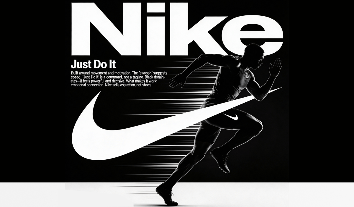
Nike sells aspiration, not shoes.
Spotify
Green that pops. Duotone imagery. Playful, slightly irreverent copy. The interface itself is part of the identity—dark mode, album art as visual identity.
What makes it work: the product IS the brand experience. Every interaction reinforces identity.
Brand identity comes in two flavors.
Static Identity
Same logo, same colors, same rules—everywhere. Think Coca-Cola. The script hasn't fundamentally changed in over a century.
Pros: easy to manage. Anyone can apply it correctly. Strong recognition.
Cons: can feel dated over time. Less flexibility.
Best for: traditional industries, single-product companies, small businesses.
Dynamic Identity
A flexible system that adapts while staying recognizable.
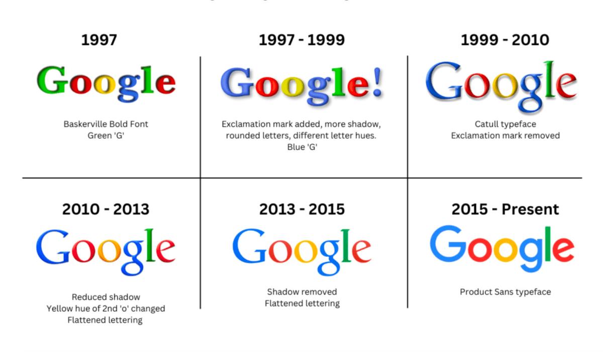
Google's logo changes daily with Doodles.
MTV's logo is designed to be endlessly reimagined.
Pros: fresh and adaptable. Works across diverse contexts.
Cons: needs skilled designers to maintain consistency. Risky if not done well.
Best for: media companies, tech platforms, brands targeting younger audiences.
Good identity doesn't start with sketching logos. It starts with research.
Step 1. Understand the Business
What makes this company different? What's its history? What does it actually do well? Often, clients don't fully know their own differentiators.
Step 2. Analyze Competitors
What colors, styles, and approaches are already taken? If every coffee shop in town uses brown and "artisan" fonts, maybe go a different direction.
Step 3. Know the Audience
Age, income, lifestyle, values, fears, aspirations. The more specific, the better. "Everyone" is not a target audience.
Step 4. Check Category Conventions
People expect certain things from certain products. Purple mayonnaise in an unconventional jar might be creative—but no one will buy it. It doesn't look like mayonnaise.
Step 5. Define Positioning

One clear sentence: what does this company offer that competitors don't? This guides every visual decision.
Step 6. Build the Brand Platform
Values: what does the brand believe in? Personality: If the brand were a person, who would they be? Mission: why does this company exist beyond making money?
Step 7. Design
NOW you start creating logos, choosing colors, selecting fonts. By this point, decisions are strategic—not arbitrary.
1. Overcomplicating the logo
Beginners try to show everything in one image. Result: visual noise. Simple logos are more memorable.
2. Ignoring competitors
If your identity looks like everyone else's, you're invisible.
3. Following trends blindly
Minimalism is great for tech companies. It might feel cold for a children's birthday party venue.
4. Skipping the strategy
Jumping straight to design without research leads to pretty pictures that don't work.
5. Forgetting scale
A logo that looks great on a website might be unreadable on a business card or app icon.
6. Cultural blindness
White means purity in Western cultures but death in some Asian cultures. Colors and symbols carry different meanings globally.
Understanding brand identity isn't just for future designers. It's visual literacy for the modern world.
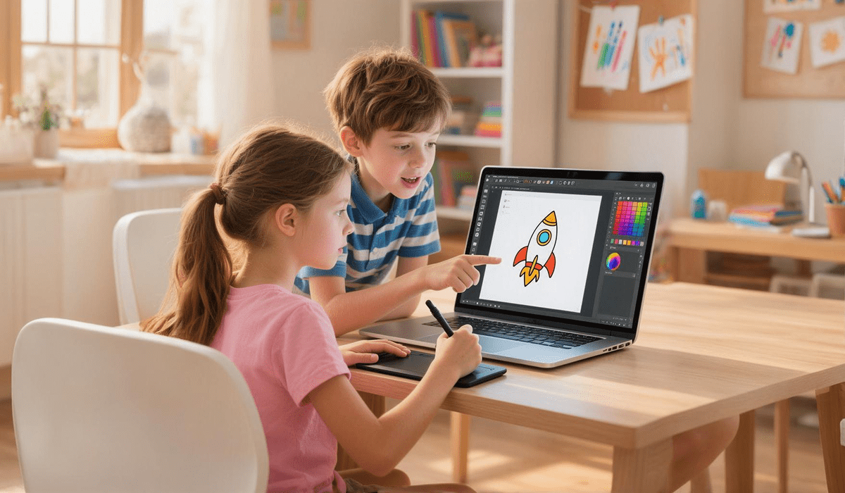
Coddy offers design courses for kids ages 7-16:
All courses are project-based. Kids build real portfolios, not just complete exercises.
What's the difference between brand identity and logo?
A logo is one element of brand identity. Identity includes logo plus colors, fonts, imagery, sounds, and the overall personality.
How much does brand identity cost?
Ranges from a few hundred dollars (freelancer, basic package) to millions (global corporate rebrand). Small businesses typically spend $2,000-10,000 for professional identity.
Can you change brand identity?
Yes — it's called rebranding. But it should be strategic, not arbitrary. Sudden changes confuse customers.
Should I trademark my logo?
Recommended but not required. Trademark registration protects against copying and gives exclusive usage rights.
At what age can kids learn design?
Basic principles work from age 7-8. Kids at this age understand that images create emotions and can analyze simple examples.
Brand identity is how businesses become memorable. It's psychology, strategy, and creativity combined.
For kids, understanding these principles builds visual literacy that applies far beyond design. They learn to think critically about the thousands of brand messages they encounter daily.
Want to give your child future-ready creative skills? Coddy's design courses teach professional principles through hands-on projects—with real tools used by real designers.
Coddy is an international coding and design school for kids ages 4-18, with 150+ locations across 28 countries. Since 2016, we've helped 200,000+ students develop technical and creative skills for the future.

Author:
Oksana Selendeeva — Coddy's Founder and CEO